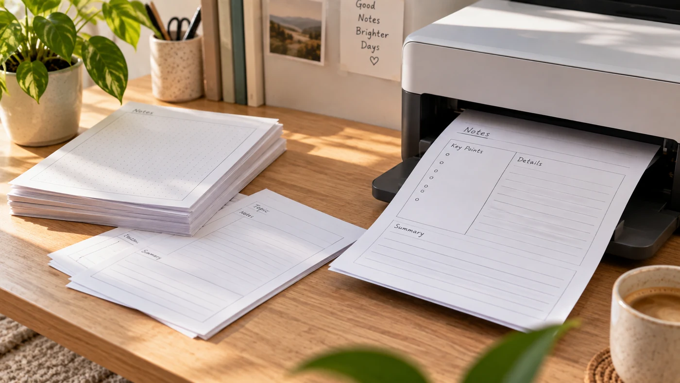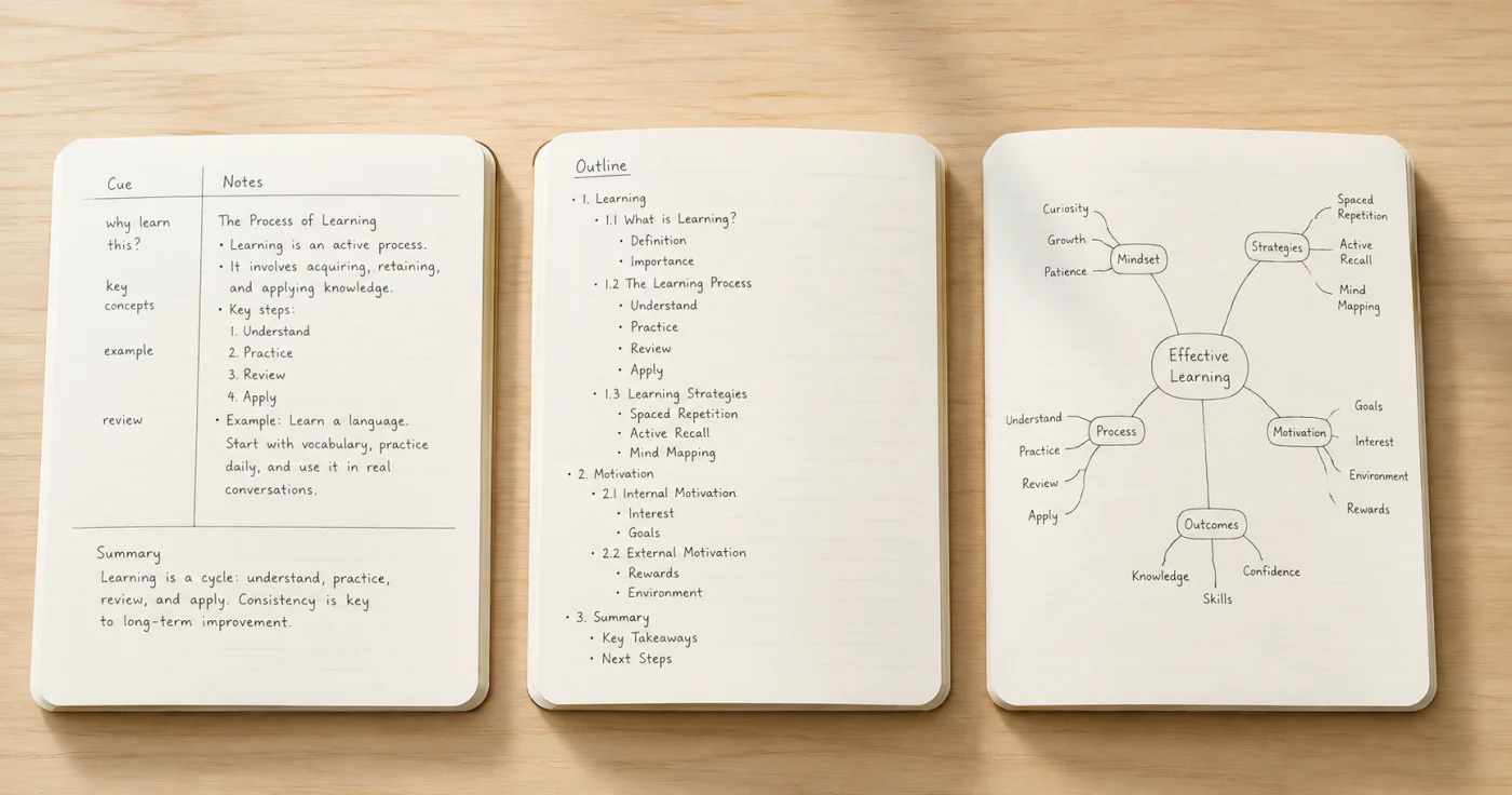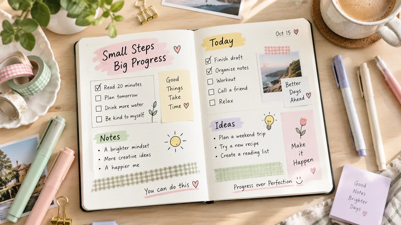
Cute notes work best when decoration supports recall instead of competing with the information. Begin with a clear heading, a small color system, and repeatable sections. Then add a few visual accents. The result can feel personal without becoming hard to scan before a class, meeting, or exam.
Build the information layer first
Write the page in plain form before decorating it:
- Give the page one specific title.
- Split the topic into two to four short sections.
- Put definitions, dates, formulas, or decisions on their own lines.
- Leave a narrow margin for questions or follow-up marks.
This first pass prevents a common problem: a page that looks finished but hides the idea you need to find later.
Pick a small visual system
Use limits to make notes look intentional:
| Element | Simple rule | Why it helps |
|---|---|---|
| Color | Choose one main color, one accent, and a neutral | A repeated palette looks coherent without making every line compete |
| Headings | Use one heading style and one smaller subheading style | Readers can see the structure before reading every word |
| Highlighting | Reserve it for terms, actions, or exam-worthy points | Important content remains noticeable |
| Icons | Repeat a tiny set, such as a star for review and a question mark for uncertainty | Marks carry meaning instead of becoming decoration |
| Spacing | Leave one blank line between sections | The page has breathing room and is easier to revisit |
Make sure text remains readable against its background. W3C’s WCAG guidance gives normal text a minimum contrast ratio of 4.5:1 at Level AA.[1] You do not need to calculate every pen color on paper, but the principle is useful: pale ink on a pale background is a style choice that can make revision harder.
Add personality in the margins
Once the structure works, add one or two small touches per section: a short underline, a border around a key definition, a simple doodle that explains a concept, or a color-coded tab. Decorative elements should point to the content rather than fill empty space.
For example, a biology page might use one leaf icon only beside process headings. A project-meeting page might use a small square only beside decisions. Repetition makes the page feel designed and gives the marks a job.
Use a quick finishing pass
Before closing a page, ask:
- Can I find the topic in three seconds?
- Is the most important idea easier to see than the decoration?
- Did I use the same color for the same purpose?
- Is there enough empty space to add one more clarification later?
If the answer is no, remove an accent before adding another one. A cute page does not need many colors or elaborate lettering to feel complete.
For study-focused structure, see these note-taking tips for students and this overview of note-taking methods. Small visual prompts can also work well for short reminders; our sticky notes guide explores that use case.
Frequently Asked Questions
How do you get aesthetic notes?
Choose a consistent color scheme and style, then repeat a small set of heading, spacing, and accent rules. Start with readable content and hierarchy; add decoration only where it helps you locate or remember an idea. Keep enough contrast between text and background that the page remains easy to read.[1]
Conclusion
Make cute notes by creating clear structure first, then using a limited palette and a few meaningful accents. When every visual choice has a purpose, your notes can look personal and stay useful when it is time to review.
References
- World Wide Web Consortium. "Understanding Success Criterion 1.4.3: Contrast (Minimum)"